FREEWAYFREEWAY·2026년 7월 23일July 23, 2026·5분 읽기5 min read
우리는 스마트폰이든 컴퓨터든, 화면이 작든 크든 모두 '모니터'라는 것을 통해 기계장치와 상호작용한다.
cm는 익숙하지만, 해상도는 또 뭘까?
픽셀과 DPI
도트(dot), 해상도(DPI), 픽셀(pixel)이라는 용어를 한 번쯤 들어보셨을 것이다.
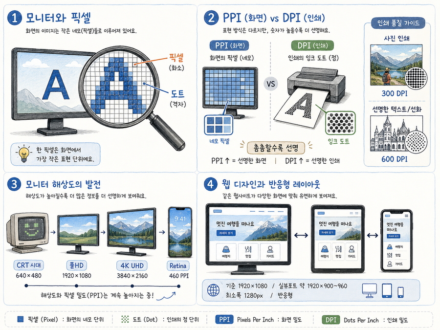
모니터에 글자 하나가 떠 있다고 하자. 그것을 아주아주 크게 확대해 보면, 여러 개의 네모난 셀 안에 하나씩 요소가 박혀 있는 것을 볼 수 있다. 마치 잠자리의 눈처럼 말이다.
이 각각의 셀을 도트 또는 픽셀이라고 한다.
그리고 DPI나 PPI는 이 도트(또는 픽셀)가 얼마나 촘촘하게 박혀 있는지를 나타내는 단위다.
DPI (Dots Per Inch): 프린터가 실제로 잉크 방울(도트)을 찍어내는 밀도
PPI (Pixels Per Inch): 디지털 화면·이미지의 픽셀 밀도
DPI는 주로 인쇄나 출력 영역에서 사용되는 용어로, 1인치당 몇 개의 도트가 들어가는가를 뜻한다. 반면 모니터 같은 화면에서는 주로 '해상도'라는 용어를 사용한다.
인쇄 해상도 — 어느 정도가 적당할까?
이전에 잠시 언급했지만, 필자가 CD 타이틀 이미지를 제작하는 아르바이트를 할 때 이것 때문에 꽤 애먹은 적이 있다. 포토샵으로 작업한 뒤, 그 파일을 직접 출력소에 가져가 인쇄까지 맡겨야 했기 때문이다.
우리가 흔히 잡지에서 보는 선명한 사진 정도의 결과물을 얻으려면 어느 정도 해상도가 필요할까? 사진만 있는 경우라면 최소 300DPI 정도면 충분하다.
하지만 라인아트나 텍스트처럼 경계가 뚜렷한 요소가 함께 섞인 이미지를 인쇄할 때는 600DPI 정도의 해상도가 필요하다.
출력하는 크기가 커진다면 어떻게 될까? 품질이 좋은 이미지를 얻으려면 당연히 DPI도 함께 늘어나야 한다.
해상도의 역사 — CRT에서 4K까지
1990년대에는 CRT 14인치 모니터가 보통이었고, 대부분 640×480 해상도였다. 1024×768은 좀 드문 편이었다.
LCD 모니터가 나오면서 해상도는 풀HD인 1920×1080이 거의 표준으로 자리잡게 되었고, 오늘날은 4K, 심지어 8K 모니터까지 나오고 있다.
아이폰의 레티나 디스플레이는 약 460PPI 정도다.
이 해상도 때문에 예전에는 전문가라면 EIZO 같은 모니터가 거의 필수이기도 했다. 오늘날은 조금 다른 이야기지만.
웹디자인과 해상도
그렇다면 웹디자인을 할 때 해상도는 어떻게 잡아야 할까?
지금도 여전히 1920×1080(FHD)을 기준 해상도로 삼되, 실제로는 브라우저 UI를 뺀 뷰포트 크기(약 1920×900~960)를 고려하고, 최소 지원폭은 1280px 정도까지 대응하는 것이 일반적인 실무 방식이다.
물론 스마트폰이나 태블릿을 위해 반응형은 기본이다.
Whether it's a smartphone or a desktop, a small screen or a large one — we interact with every digital device through a display.
Centimetres feel familiar. But what exactly is resolution?
Pixels and DPI
You've probably come across the terms dot, DPI, and pixel at some point.
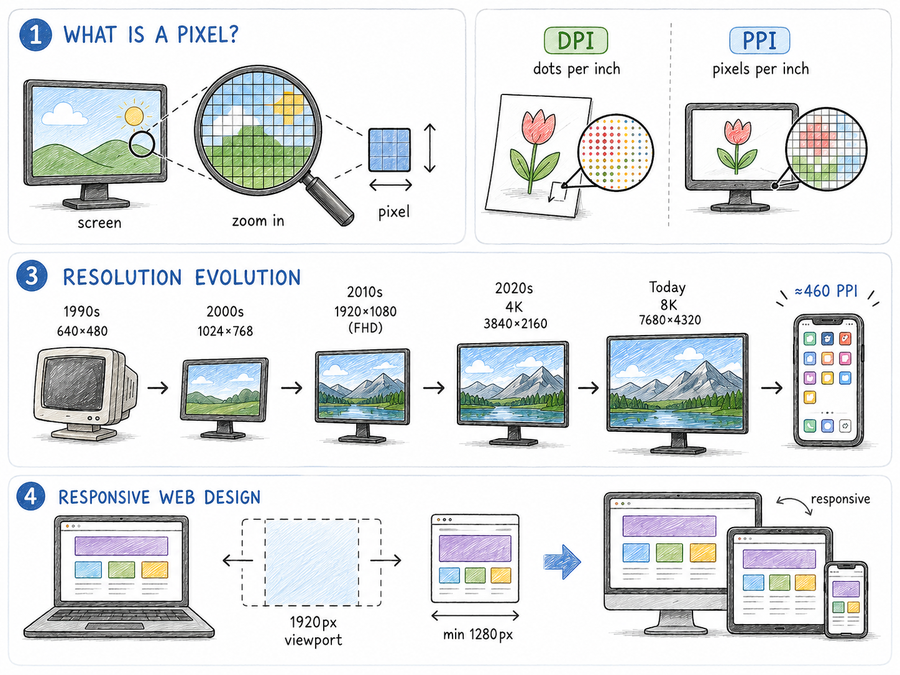
Imagine a single character on a screen. If you zoom in far enough, you'll see that it's made up of many tiny square cells, each holding one element — like the compound eye of a dragonfly.
Each of those cells is called a dot or a pixel.
DPI and PPI are units that describe how densely those dots (or pixels) are packed together.
DPI (Dots Per Inch): the density of ink dots a printer lays down
PPI (Pixels Per Inch): the pixel density of a digital display or image
DPI is mainly a printing term — it describes how many dots fit into one inch of printed output. For screens and displays, the word "resolution" is more commonly used.
Print resolution — how much do you need?
I mentioned this briefly before, but I ran into real trouble with this when I was working part-time creating CD cover artwork. After finishing the design in Photoshop, I had to physically take the file to a print shop and have it printed there.
So how much resolution do you need to get results as sharp as a magazine photo? For images that are photos only, 300 DPI is generally enough.
But when you're printing images that include line art or text — elements with sharp, defined edges — you'll typically need around 600 DPI.
What happens as the output size gets larger? If you want to maintain quality, the DPI requirement rises along with it.
A brief history of resolution — from CRT to 4K
In the 1990s, a 14-inch CRT monitor was the norm, and most ran at 640×480. A resolution of 1024×768 was considered fairly high-end.
As LCD monitors took over, 1920×1080 Full HD became the de facto standard. Today, 4K and even 8K monitors are available.
The Retina display on the iPhone sits at around 460 PPI.
For a long time, professionals considered monitors like EIZO almost essential because of these resolution demands. That story has changed somewhat today.
Resolution and web design
So what resolution should you target when designing for the web?
The standard in practice is still to design at 1920×1080 (FHD) as the baseline, while accounting for the viewport — the usable area after the browser UI is subtracted, roughly 1920×900–960. The minimum supported width is typically around 1280px.
And of course, responsive design for smartphones and tablets is a given.
댓글Comments